Colour Relationships
This exercise is about colour relationships and is broken down into two parts.
The first part is about the primary colours and their opposing secondary colour. For this part, I had to take three photographs of the colours at their correct ratios. These ratios were initially suggested by the German poet J. W. Von Goethe, and the ratios of colours for harmony are as follows:
Red: green 1:1
Orange: blue 1:2
Yellow: Violet 1:3
These ratios came about after he assigned the following values to the six primary and secondary colours: yellow 9, orange 8, red and green 6, blue 4 and violet 3.
The second part of this exercise is about 3-4 images that don’t follow the strict guidelines set above. For these images, I saw colours that when I looked at them, caught my eye.
Part One
For this part of the exercise, I was struggling for a while with what to do. It came to me after watching a cookery programme, that I would try and mimic the patterns/designs that sometimes sit on top of cakes that are done in icing. I over estimated how much of the mix I would need, and made far too much base mix up, using icing sugar and water. I had to add plain flour to get the consistency I required, as I ran out of icing sugar (but this is a learning point for me to think about how much I actually need).
Red/Green

42mm, f/5.6, 1/30sec, ISO-400
As you can see from this image, the two colours are an equal split of 1:1. I decided to put a bit of a pattern into the colour, to make it more pleasing on the eye as when I initially poured the two colours onto the plate, it was uninspiring and flat.
Orange/Blue

55mm, f/5.6, 1/15sec, ISO-400
In this image the colour split is 1:2. When looking at this image, there is no overpowering colour, therefore I feel that the 1:2 ratio is ideal.
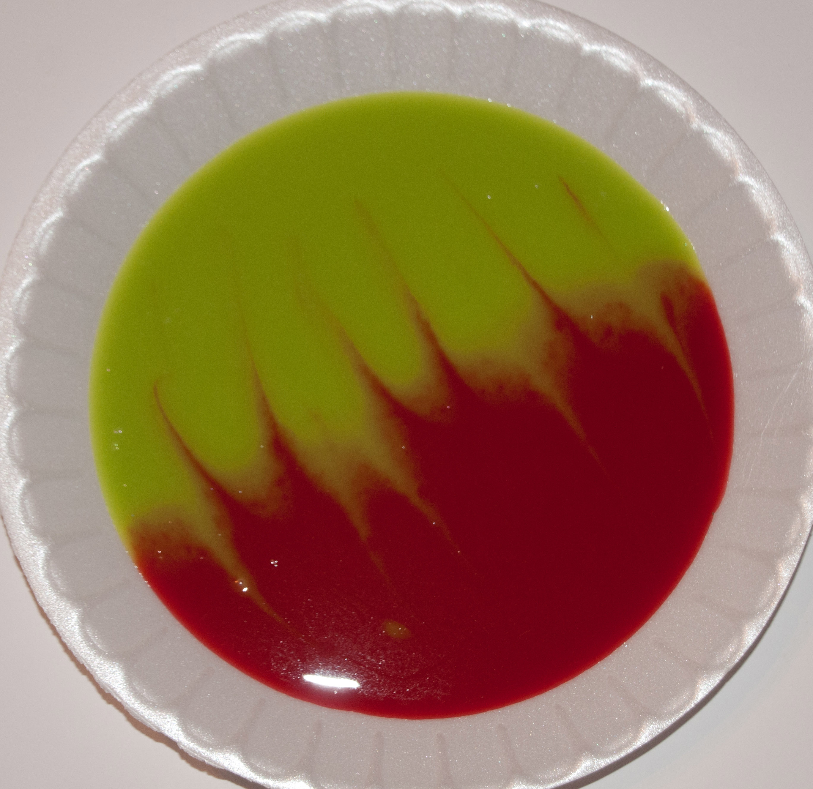
Yellow/Violet

46mm, f/6.3, 1/13sec, ISO-400
In this image the colour is split 1:3. What I have noticed about this image, is that although the colour is yellow, because it is sat on the darker violet, it makes the yellow look orange. This is something that I am now aware of, and when it comes to down still life like this, I will compensate by making the yellow brighter when mixing.
Part Two
For this part, I was allowed to take photographs of colour combinations that appealed to my eye, however when looking, I didn’t really see colours that appealed to me, so I relied on colours in scenes, that drew my eye and held it for longer than normal.
What I noticed after taking lots of photographs, was that yellow featured in all of them, even if they are of different brightnesses. I don’t know why this has happened; it has just worked out that way.
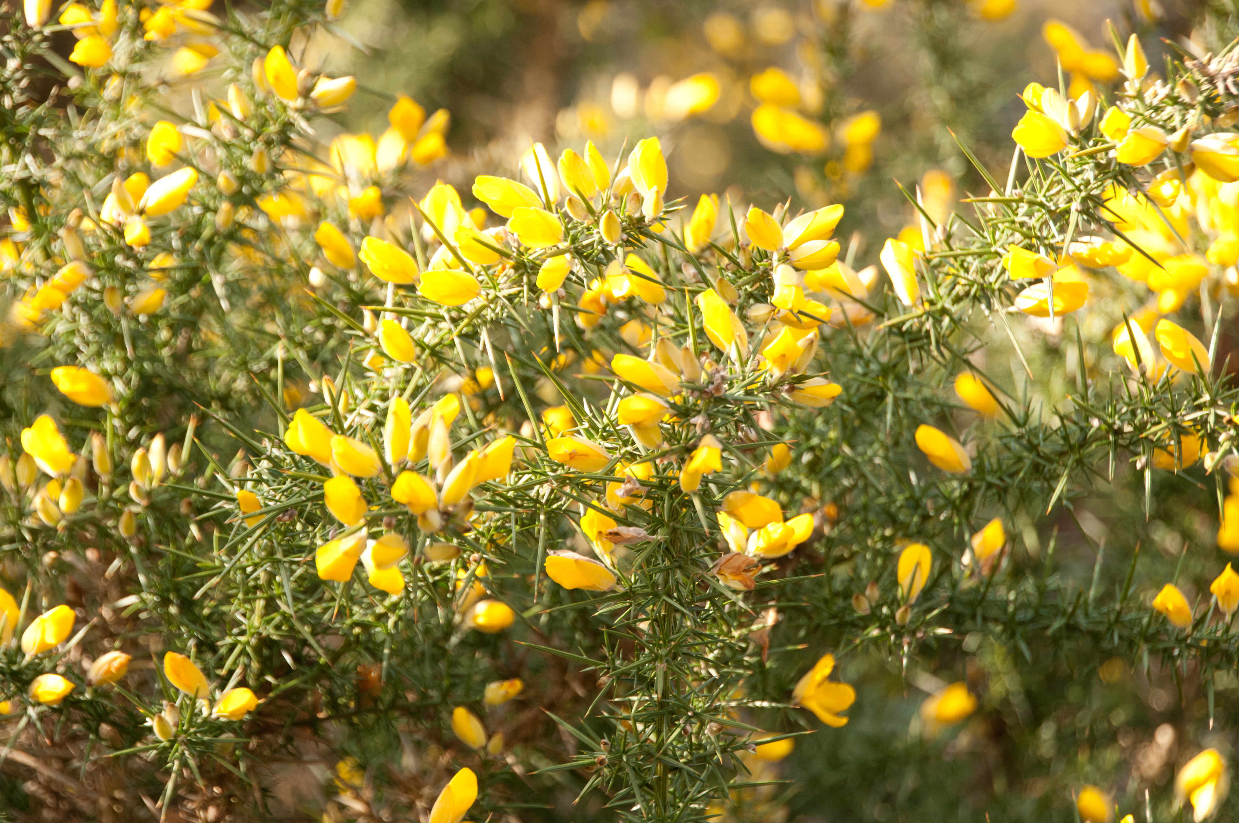
Green/Yellow
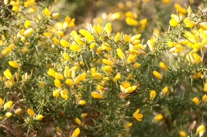
120mm, f/6.3, 1/250sec, ISO-400
If we used the Goethe scale, then for harmony within the image the ratio should be 1:1.5, however as the yellow is very prominent and overpowering, it adds tension to the image. The yellow appears very bright as you have the green contrasting background which as a cool colour; helps bring out the warmth of the flowers.
This image is more about my liking of the colour of the flowers showing spring arriving, than just the Green/Yellow combination. These bushes always draw my eye when I am walking about.
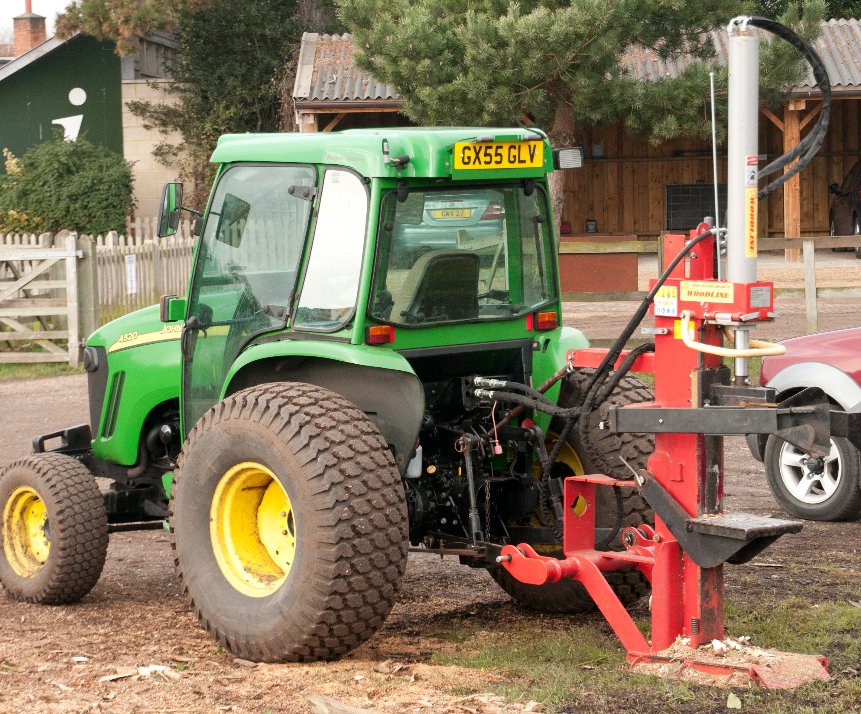
Green/Yellow/Red/Blue

65mm, f/6.3, 1/250sec, ISO-400
Whilst out walking the dog, I came across this tractor on Wimbledon common. It initially caught my eye, as the colours are quite bright (slightly muted due to exposure to environment), compared to the background. I walked round it to try and get the best angle, and found that by putting it against the darker background, the warm colours stood out a lot more. I am being cheeky by adding the light blue into this image, but if you look carefully through the glass on the tractor, you can see the blue of the car in the background.
Yellow/Blue
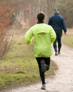
185mm, f/6.3, 1/250sec, ISO-400
I saw this image coming from a distance, and by changing where I was stood I was able to manipulate the scenario, but I only had about 2 seconds to get it right.
I chose this image, as when you combine these two primary colours, you get green, which can be seen in the colour of the grass. The yellow is what draws the eye initially, due to it being one of the fluoro yellow safety type running jackets. I feel that this appears even brighter, due to having the dark blue right behind it in the background.
I have enjoyed doing this exercise. I am starting to enjoy doing the still life work, even if it is way out of my comfort zone, and I hope to see an improvement on this type of work.
As I stated above, I have learnt that when using liquids for still life, on certain occasions, the colours when placed on one another may take on a different saturation (this becomes apparent in the yellow/violet image) as the yellow appeared brighter when it was mixed and on its own.
For part 2, I found it difficult to find examples that really appealed to me, but relied more on ones that caught my eye and made me stop and look at it longer than I would do normally.